Title:
STIMOROL_RETRO
Design by:
cbreeze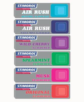
Words by the designer:
I went with the retro style color blocks to represent the different
Stimorol flavours- the muted background(silver foil)is to make the colors pop and attract the eye and I chose the font because I thought it ties in with the retro theme.The idea of the blocks is that they remind me of a control button(cellphone,game controller,etc-the twist on modern)everything we love including Stimorol...
shoutbacks
no shoutBacks yet