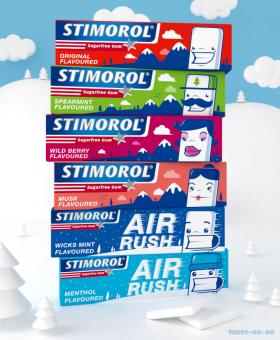
Stimorol - Character Packs by TokyoGoGo


My submission revolves around 6 unique characters, each one represents a Stimorol Sugarfree Gum flavor. I used the simple shape of a piece of Stimorol gum as the basis for each character - a clean, cheerful character that relates to its flavor. I felt the flavor colours should not stray too far away from what consumers have become familiar with. New, brighter tones would allow for consumers to notice the new packaging, but still be able to identify their favorite flavour. With regards to the display cases, the characters are enlarged so they stand out. The landscape is tileable in order for the backgrounds to flow both in width and depth when the cases are placed alongside one another. These cases are also effective in a single case display. Ultimately the packaging has a clean, crisp appearance that can be identified instantly. The character concept will last and has the ability to be expanded into a fully fledged campaign that a younger generation can relate and respond to.
